Data Storytelling
Data can tell an important story, but like any storyteller, it can’t always be taken at face value. As a data storyteller, I am constantly thinking about how to best contextualize the numbers and most accurately convey their value.
Site Context Analysis: Biking Map
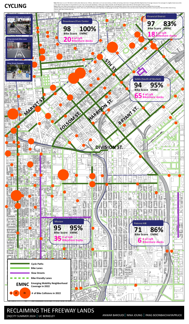
About: This transit map illustrates biking infrastructure and bike safety data along a 2~ mile stretch of the San Franscisco I-80 freeway. This was part of a site context analysis for a freeway removal plan in San Francisco. This plan served as the studio project for the UC Berkeley's In[City] urban design summer program.
Results: Determined that biking infrastructure was lacking in the east-to-west direction below Division St., which matched a lack of other public transit options in the area. It was also decided to differentiate between bike lanes and cycle paths, the latter being paths that are separated from motorized traffic and dedicate to cycling or shared with other non-motorized vehicles. This created a more accurate picture of bike safety as streets categorized as bike lanes or bike-friendly streets didn’t offer as much protection for bike riders.
Data Visualization Tools and Workshops
Turns out, you don’t need to be a CS major to analyze data. I’ve familiarized myself with data tools from these institutions:
Northwestern University's Knight Lab
〰️
Google News Initiative
〰️
DataCamp
〰️
ArcGIS
〰️
Tableau
〰️
Alteryx
〰️
Northwestern University's Knight Lab 〰️ Google News Initiative 〰️ DataCamp 〰️ ArcGIS 〰️ Tableau 〰️ Alteryx 〰️
To stay up-to-date on best data analysis practices and ethics around social impact work, I’ve attended the following workshops:
Numbers & Narratives: Unlocking Data for Public Good | Open Data Week 2025
Using Digital Spaces to Strengthen Social Connections | New_Public
Measuring the Impact of Socially Connected Communities Efforts | Healthy Place by Design